Dayly Application Design and Prototype
View prototypeThe Problem
The problem we tried to solve was to create an application for students to better plan their day to day functions that integrates with school-based assignment systems (like Canvas). Our team was tasked with choosing a topic, conducting research, and creating a design all within two months. We worked on our own timeline, and conducted short research and design stints. Below you will see our work and the outcomes we were able to achieve in such a short time with little to no instruction, other than the expectation of a design outcome at the end.
Competitive Analysis
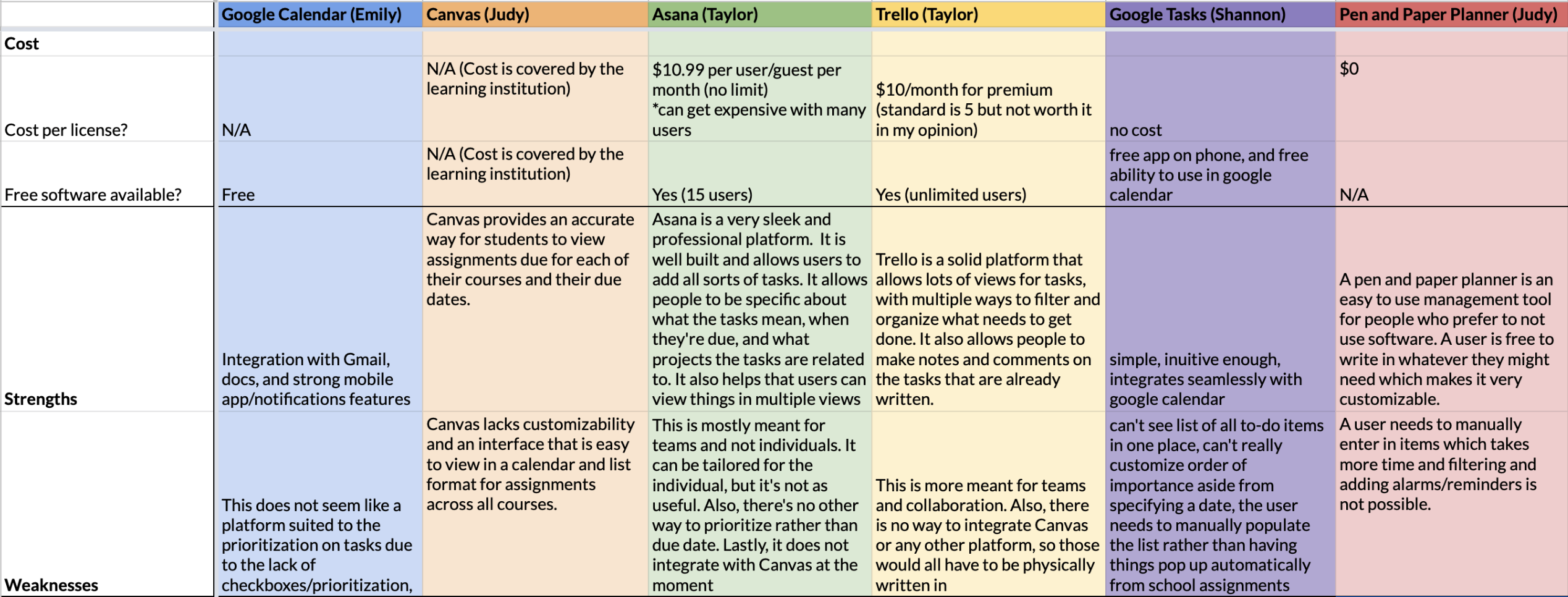
A competitive analysis was conducted by comparing the products and services that our group viewed to be closely related to our idea. We ended up meeting to discuss important metrics, prioritizing customizability, ease of use, important features, cost, and how widely known the service was. We chose to analyze six different services, including Google Calendar, Canvas, Asana, Trello, Google Tasks, and traditional pen and paper planners. This exercise allowed us to see what the services and products had to offer so we could base our application off of their strengths while adding in our own elements.
User Research: Survey
Due to the amount of time we had to complete our process and the constraints our team had, we determined that a survey would be the best way to conduct user research. We created a survey, and sent it to multiple students across campus, gaining just over thirty responses in a couple of days. We would have liked more, but these responses did give us some great insight as to what we should be focusing on in our design. The results were then analyzed, and the major findings are listed below.
Major Findings
- Our design should have preset categories as well as an open area to allow users to input their own
- Focus on a mobile application rather than desktop - this was expressed by many people
- Allow users to cross things off or click a checkbox when completing the task
- Allow users to set reminders about tasks and events in the interface
- Allow users to customize the views they want to receive their information in (include multiple views like a calendar and a list)
Low-Fidelity Wireframes
After taking ideas from our survey results and feedback from classmates in this first stage of the design process, our team designed some low-fidelity wireframes to get a better idea as to what the basic screens of the application would look like. Since we only had a couple of days in this iteration, we only focused on the main screens of the application.
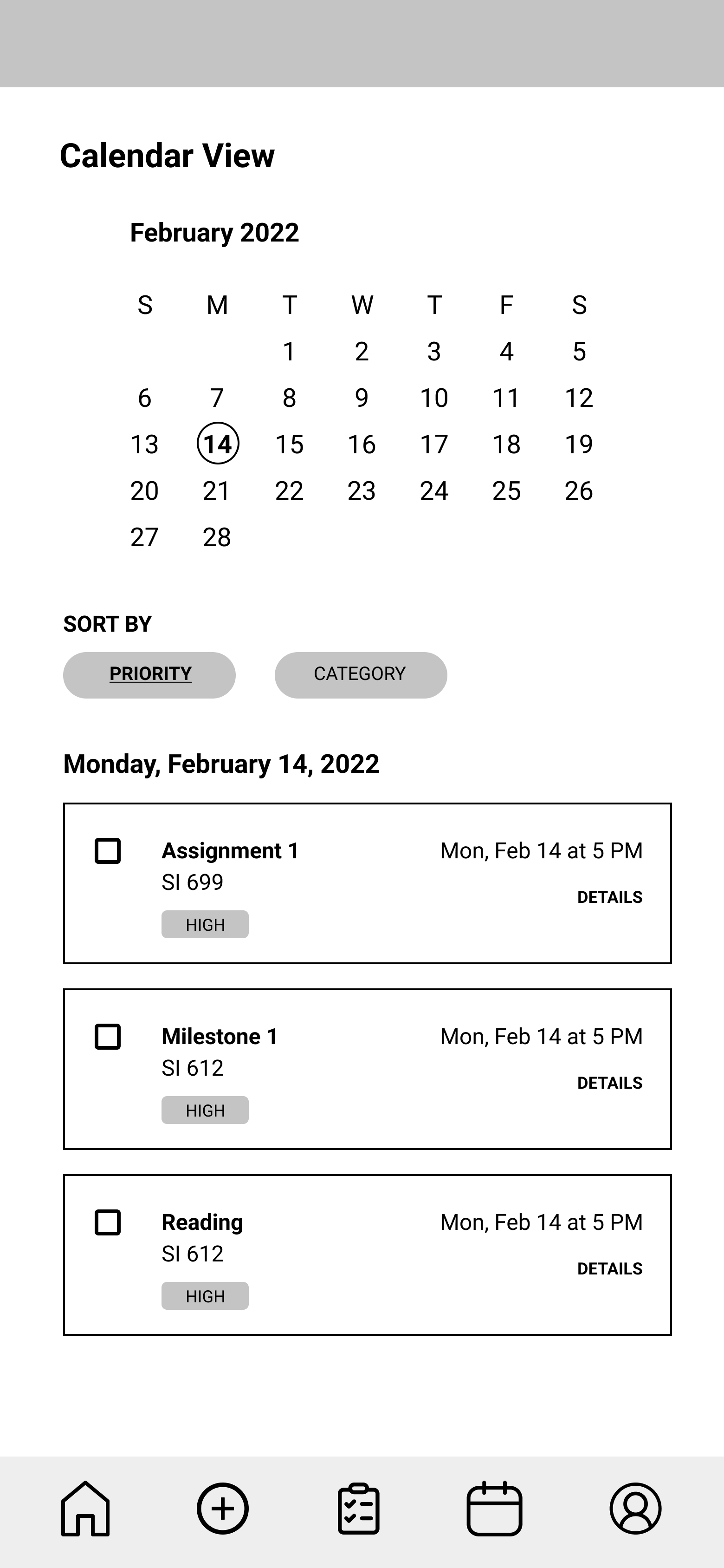
Prototype: First Iteration
Once we got feedback on our wireframes, our team was able to create our first interactive prototype. This prototype was meant for our first round of user testing, and was a baseline for the team to use for user research.
User Testing
Our group conducted user testing methods with five participants over the span of a couple of days. We tested our first prototype by giving users different tasks with a few subtasks.
User Testing Tasks
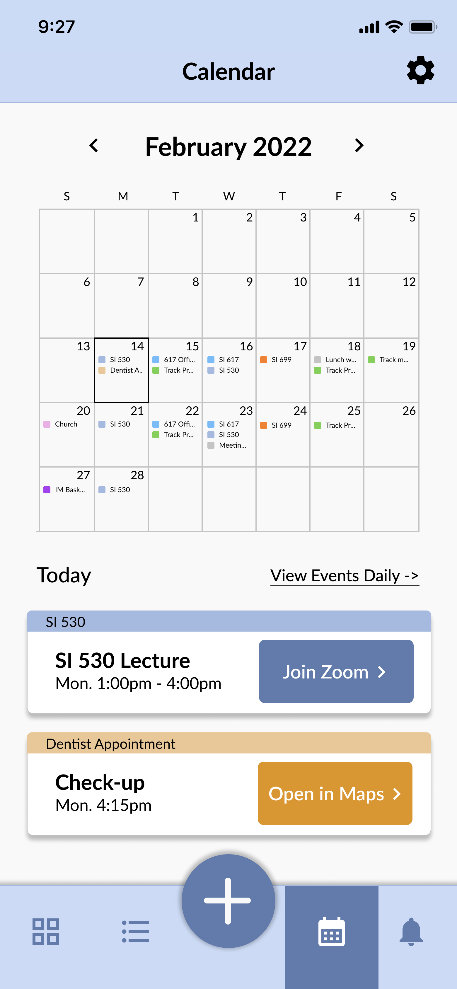
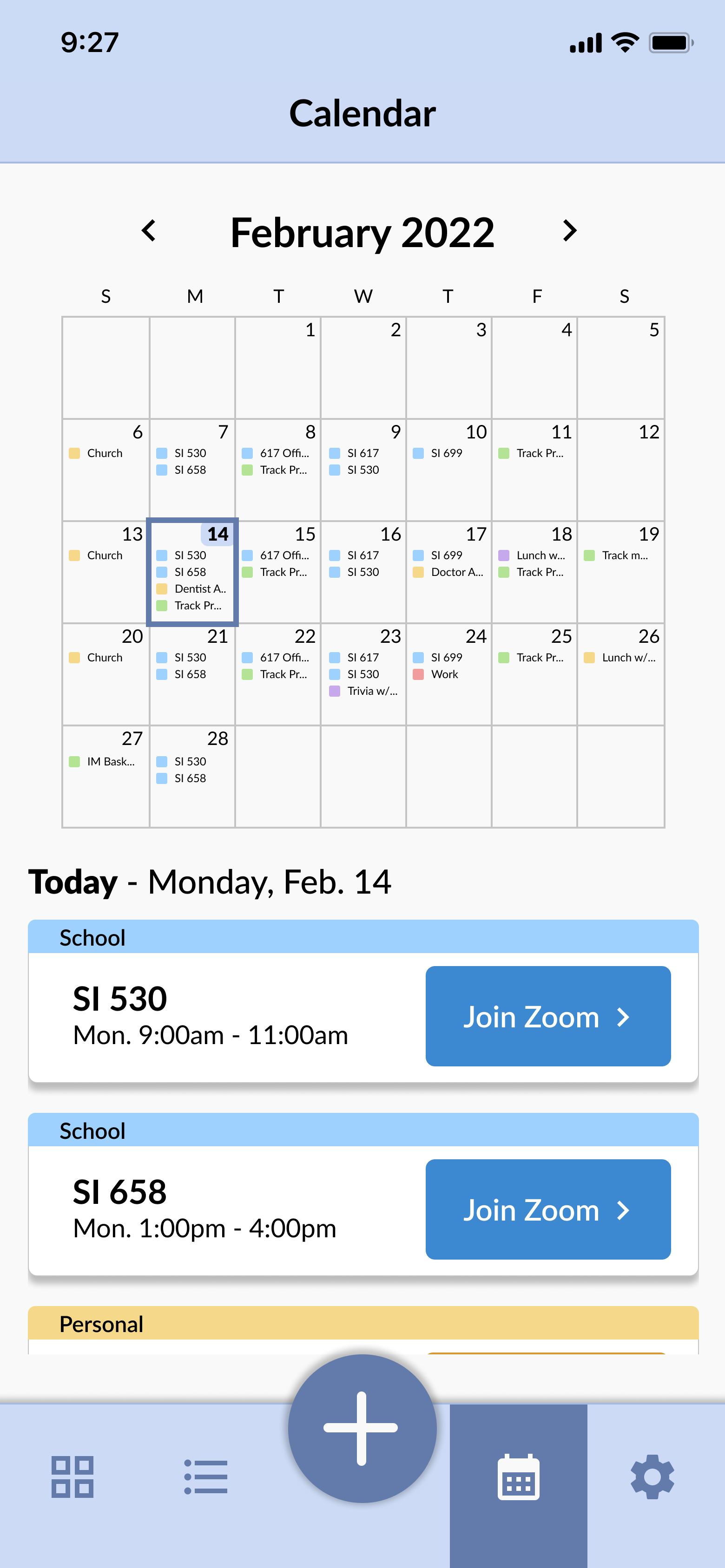
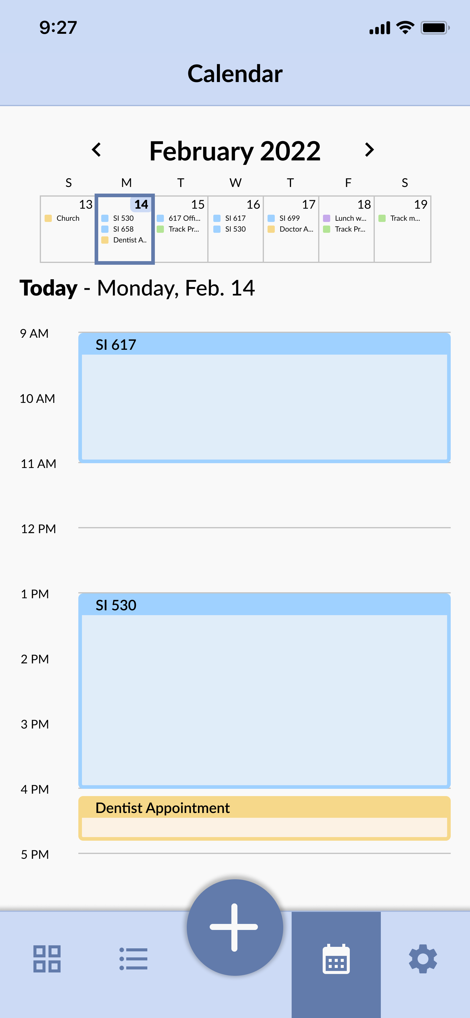
- Your friend wants to have lunch on March 1. View your daily calendar for March 1 to see when you might have time for lunch that day.
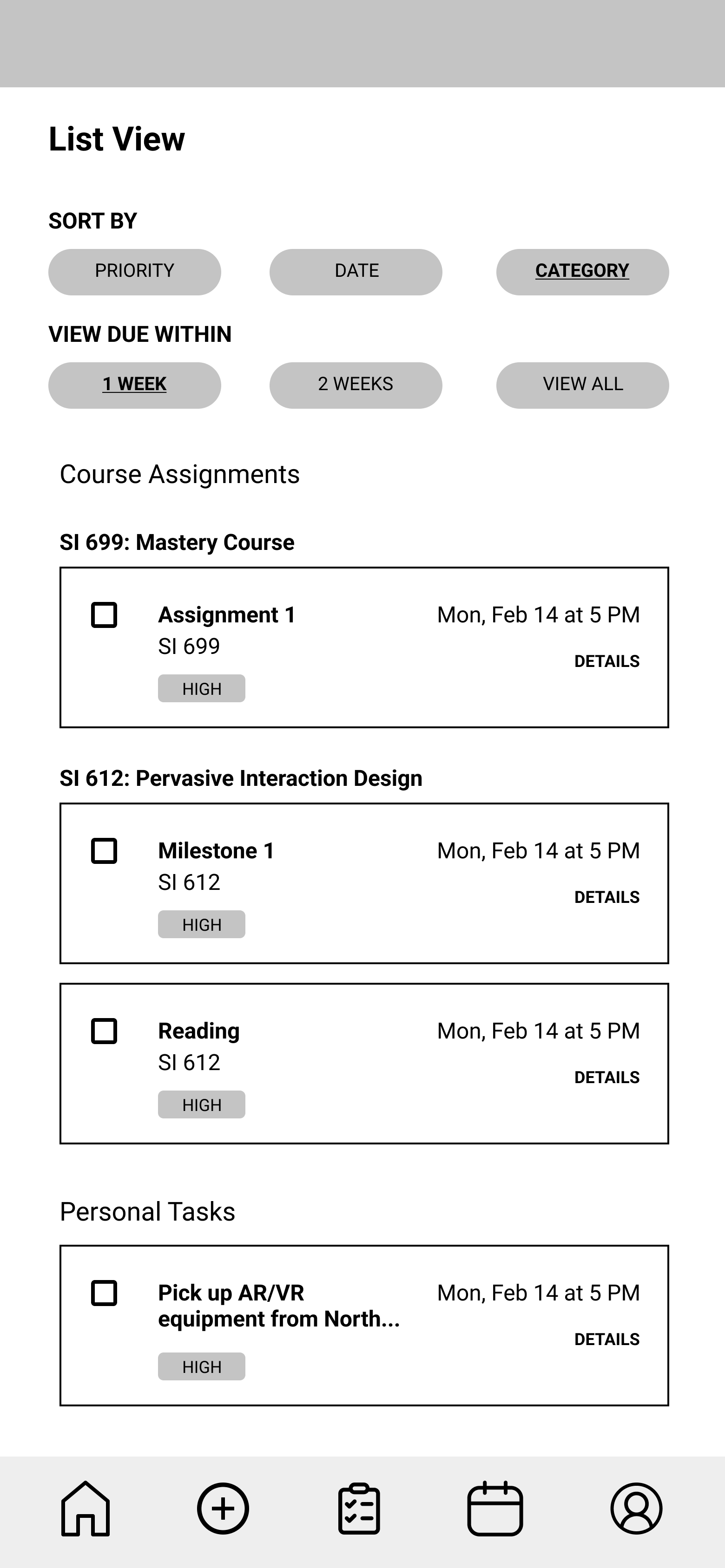
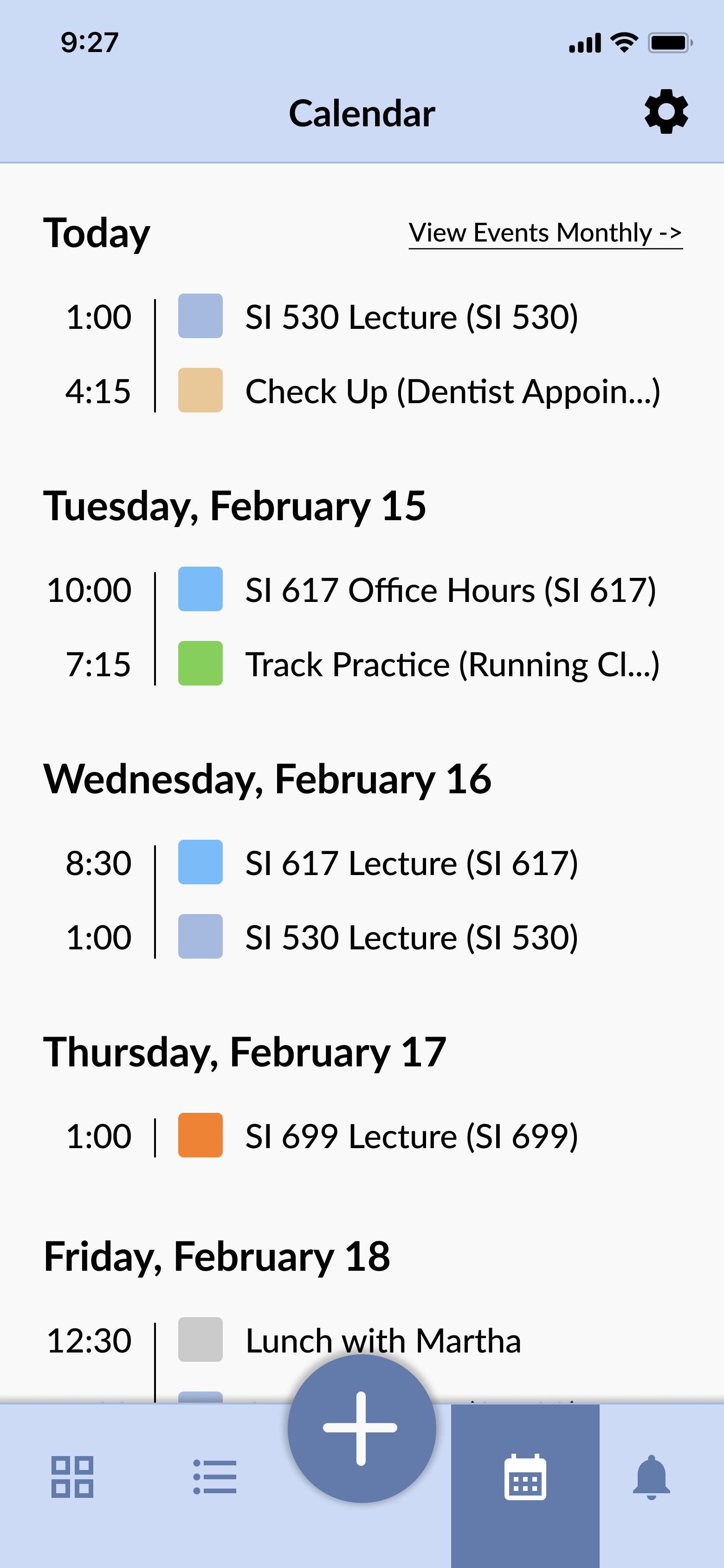
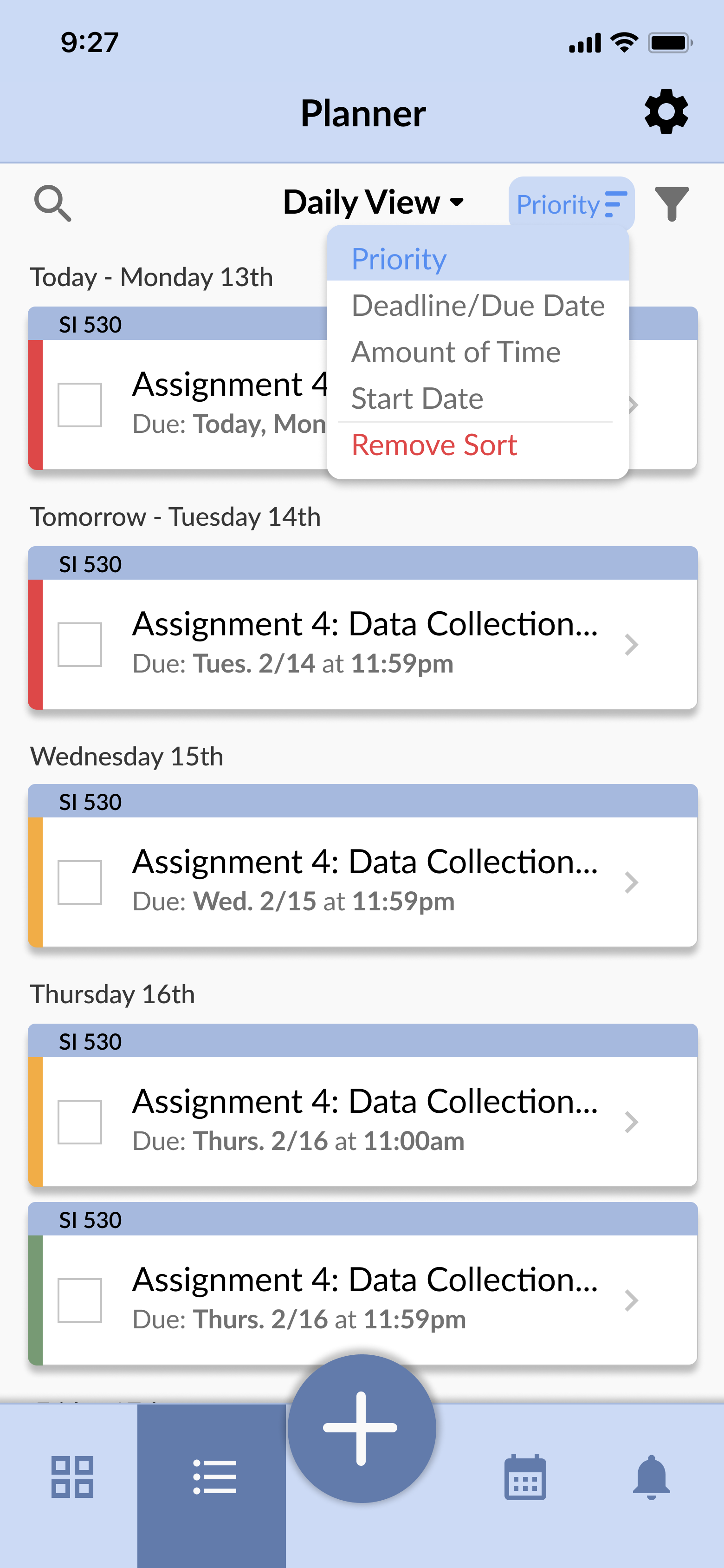
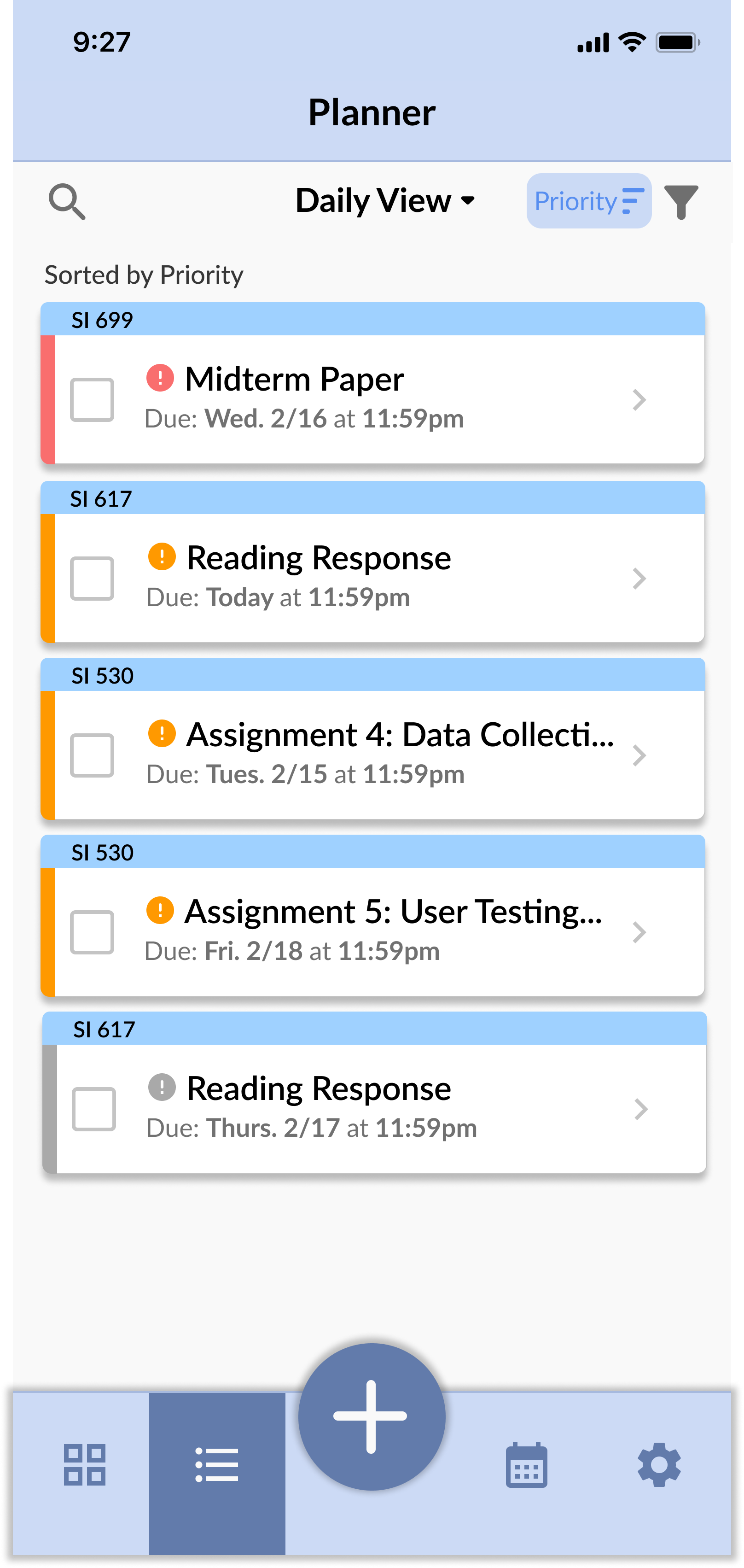
- You just came back from a weekend trip and you haven't checked your assignment due dates in a few days. You're looking for an easy way to view all of your upcoming tasks and deadlines. See if you can find a way to get to the planner/list view and then organize them by deadline.
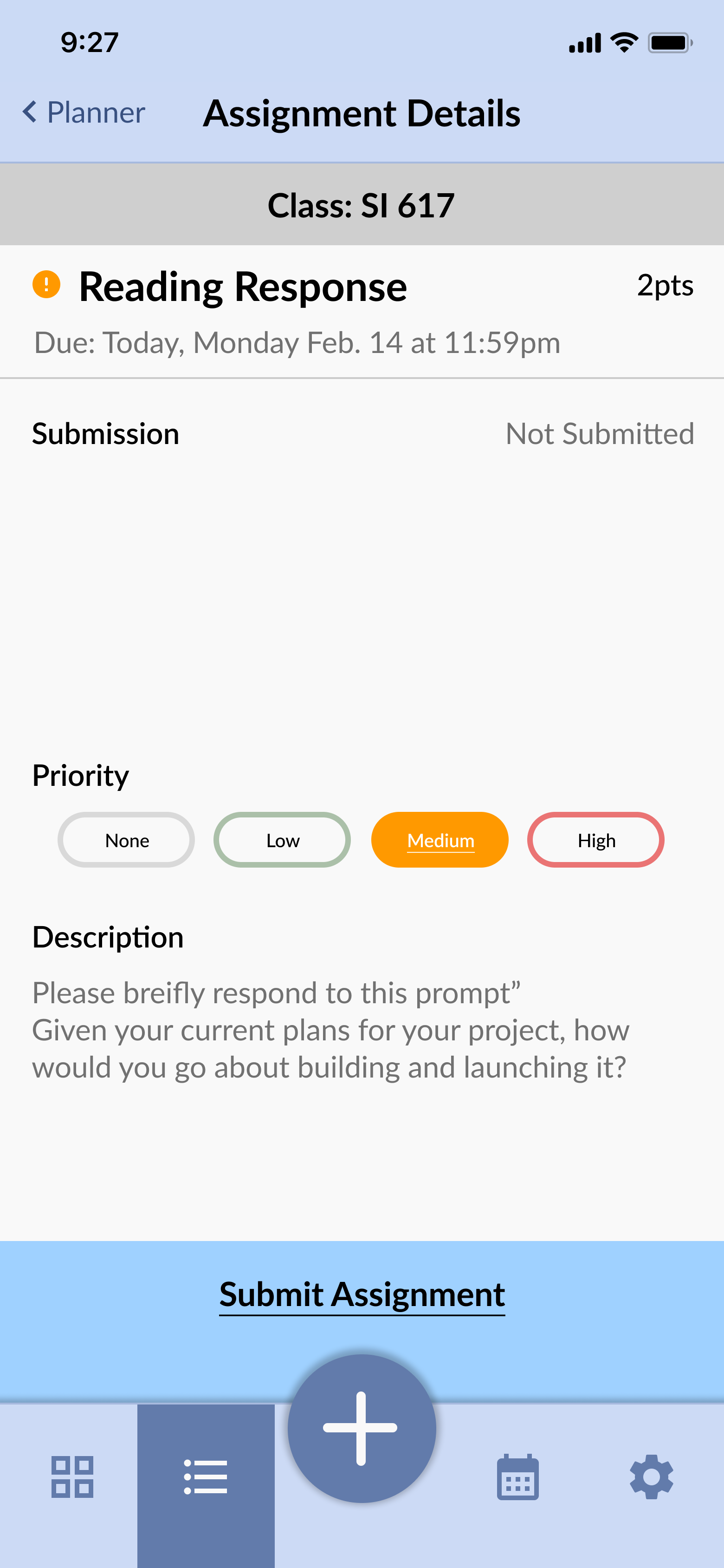
- You've found your next assignment due. Now see if you can view the specific assignment details so you can get started on it right away.
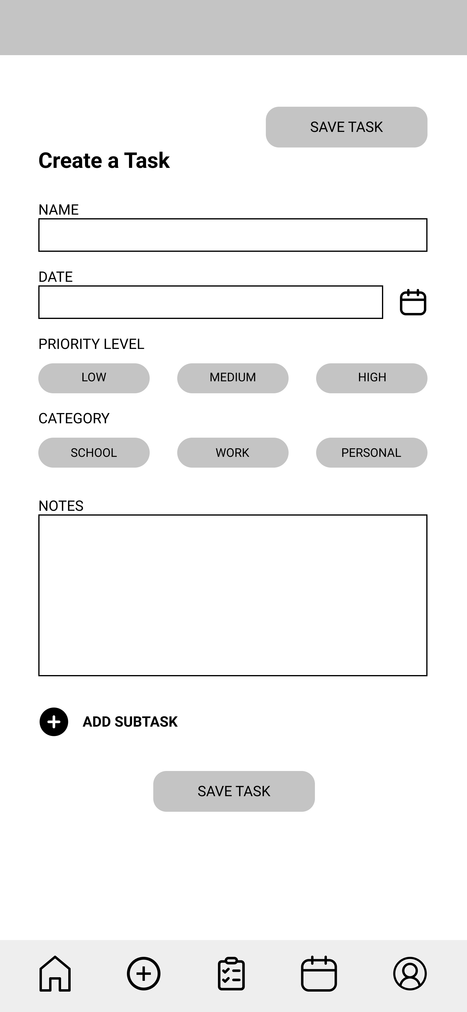
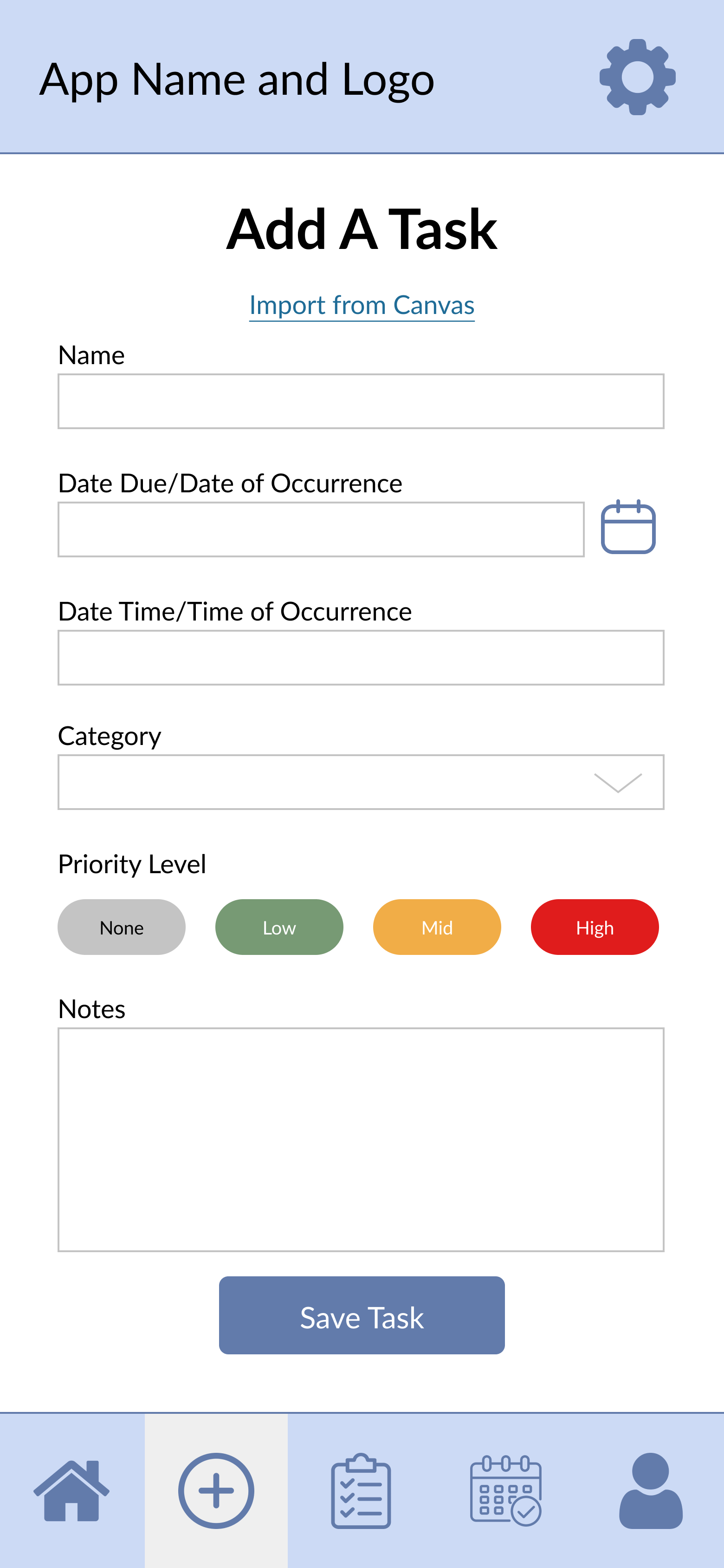
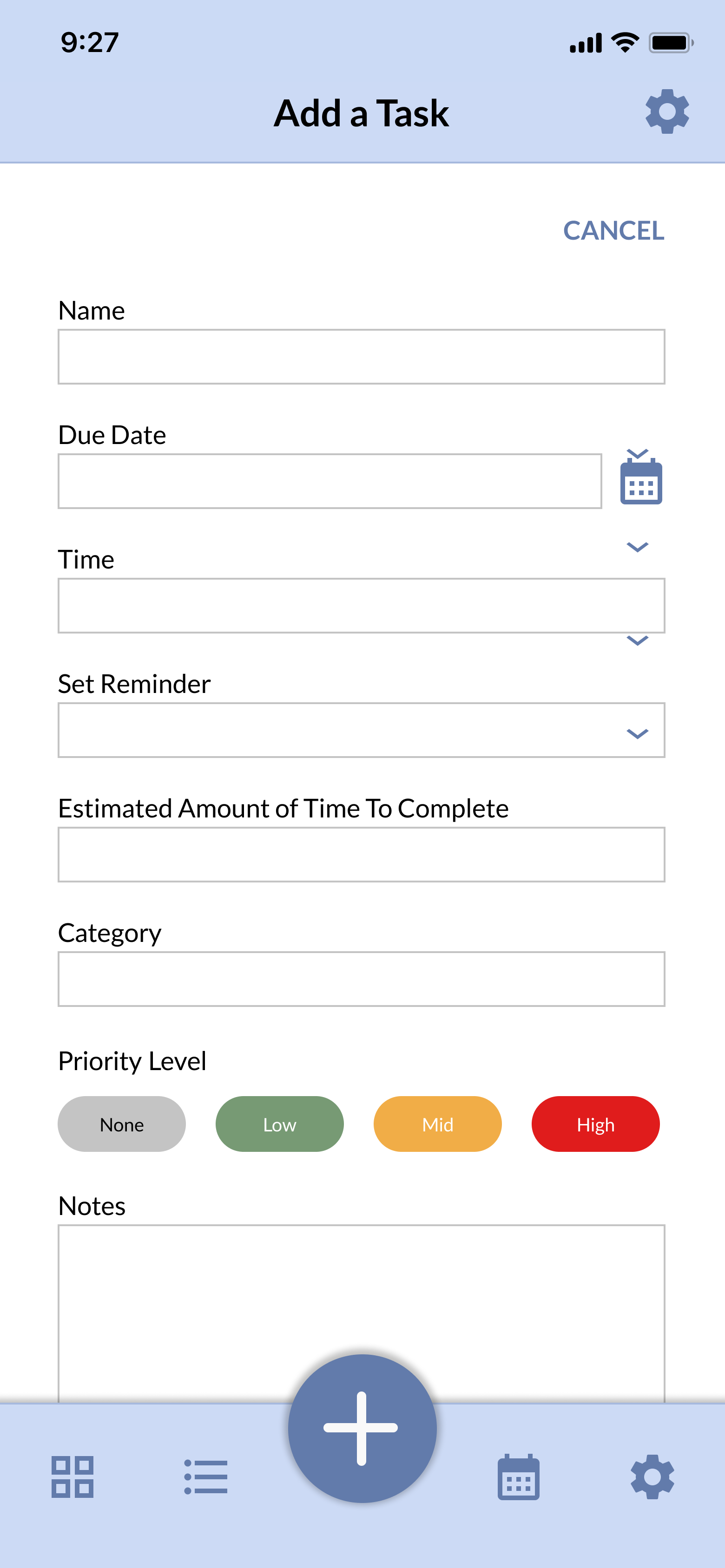
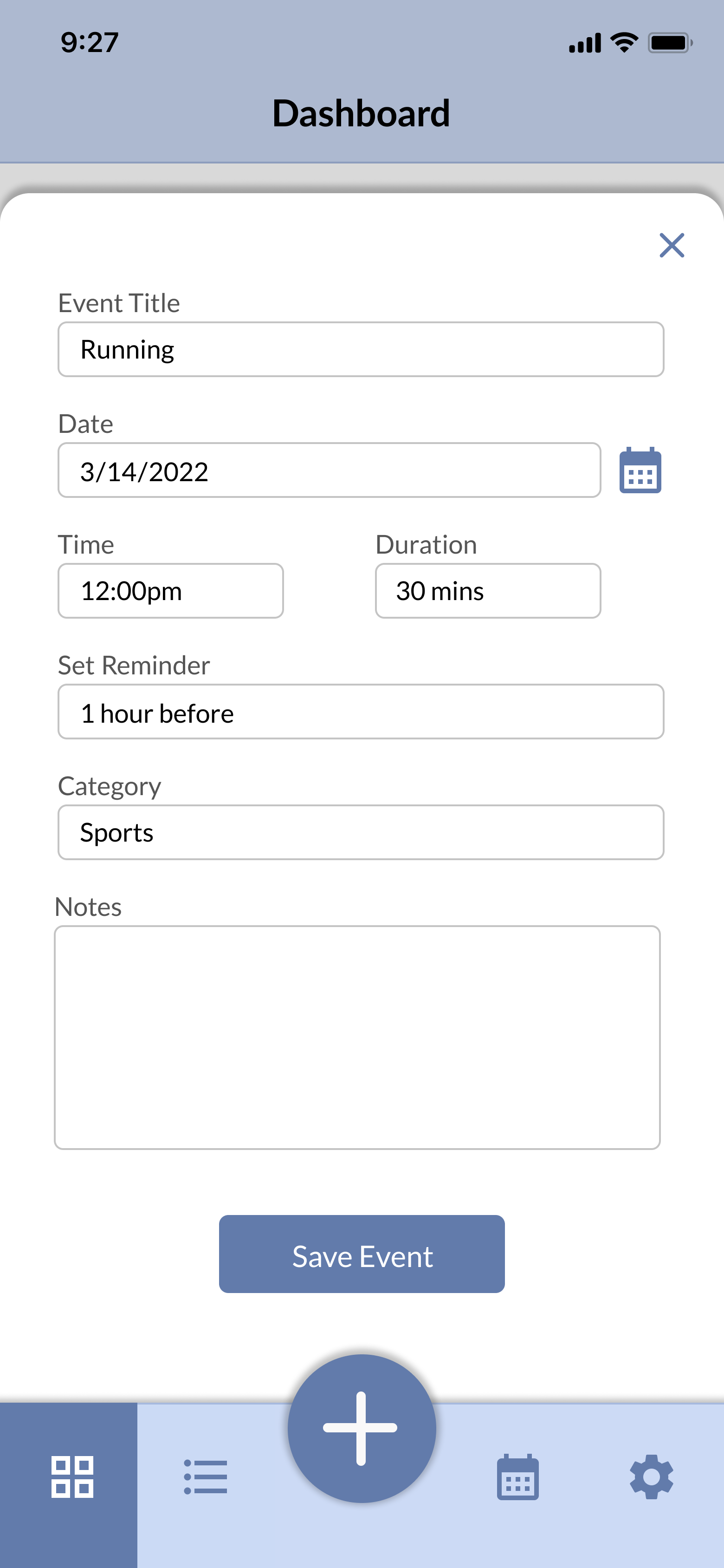
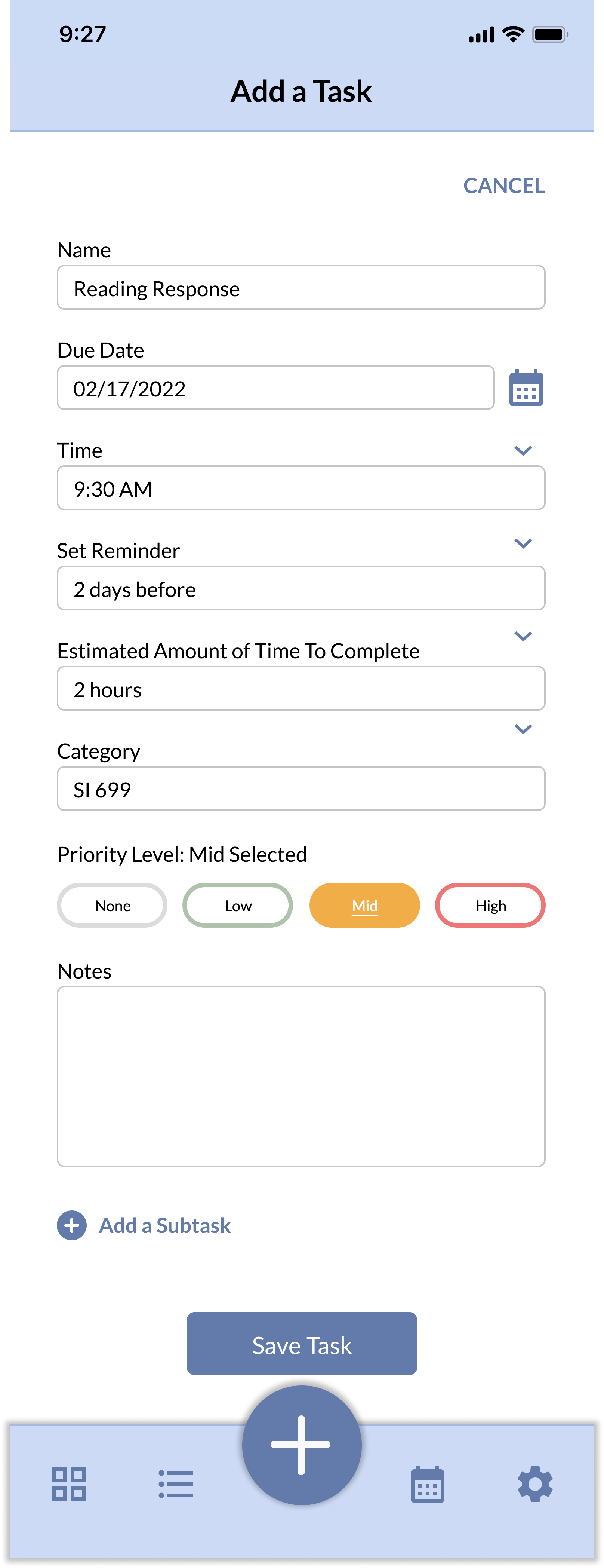
- Imagine that you are adding an assignment into your planner that you need to complete for one of your courses. Something to note is that the assignment is a medium priority. How might you go about adding the assignment? [The user needs to go through the complete flow of adding a task.
- Now imagine that you are adding a lunch appointment with a friend into your calendar? Where would you navigate to accomplish this task?
User Testing Findings
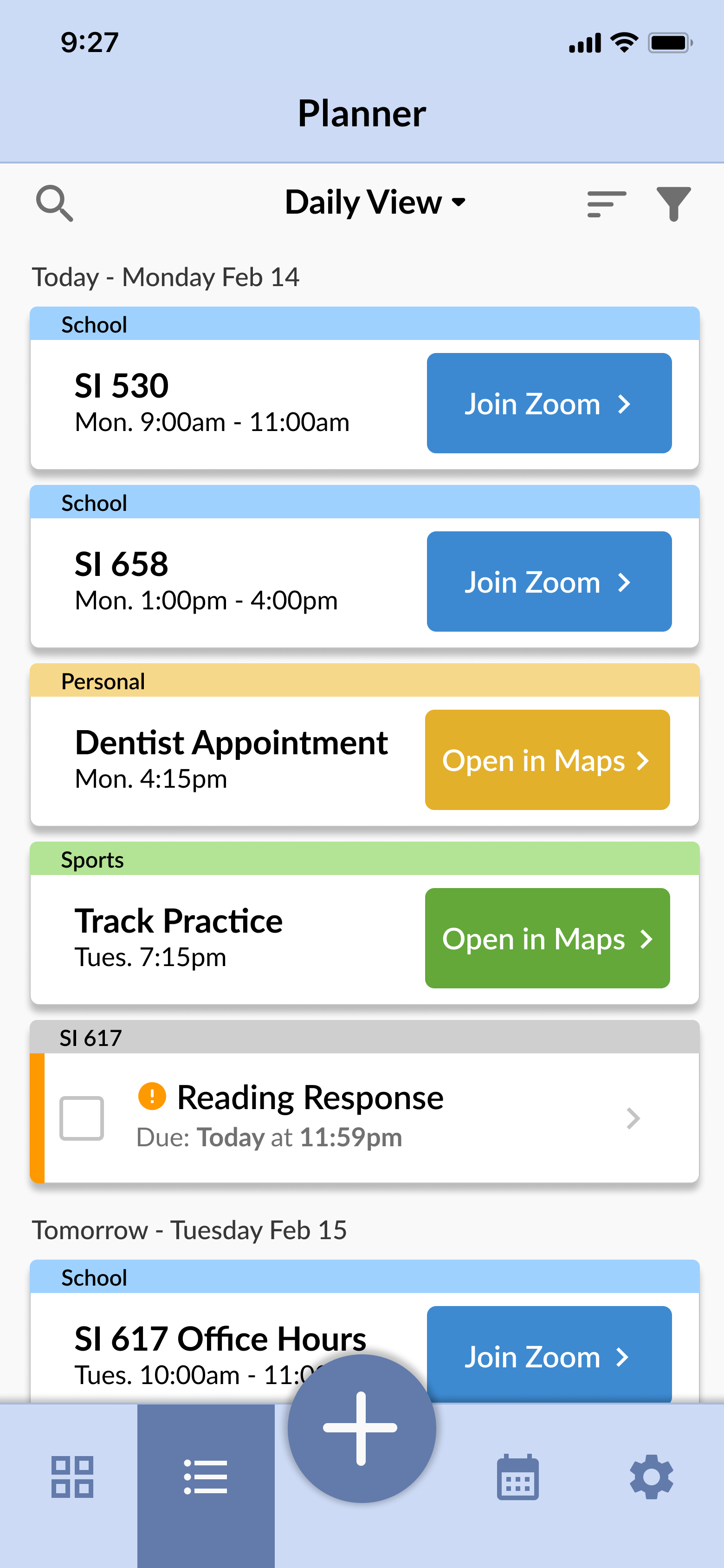
- One main problem with the first task is that users couldn't tell the duration of the events or if the time listed was a start or stop time.
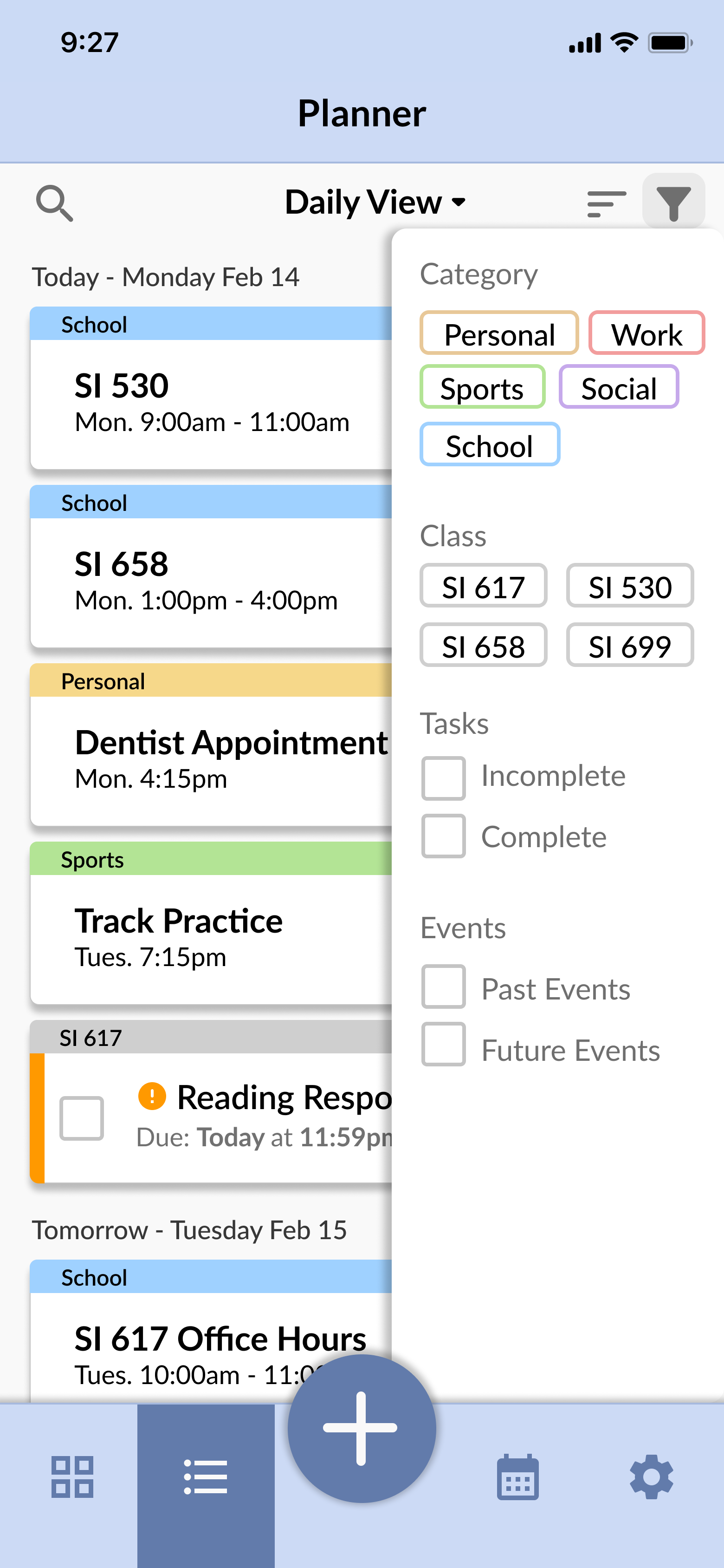
- The icons for filtering and sorting were not intuitive and that users had trouble closing the menus.
- For the third task, we got plenty of great feedback from users for this task though, including which fields should be mandatory, which fields should be filled in automatically, and how the user can interact with the experience (do they have to fill out the fields in order, etc.).
- Users also brought up the wording of “event” vs. “task” and how Google calendar uses the same wording, so we should make sure our users know what these mean in our application.
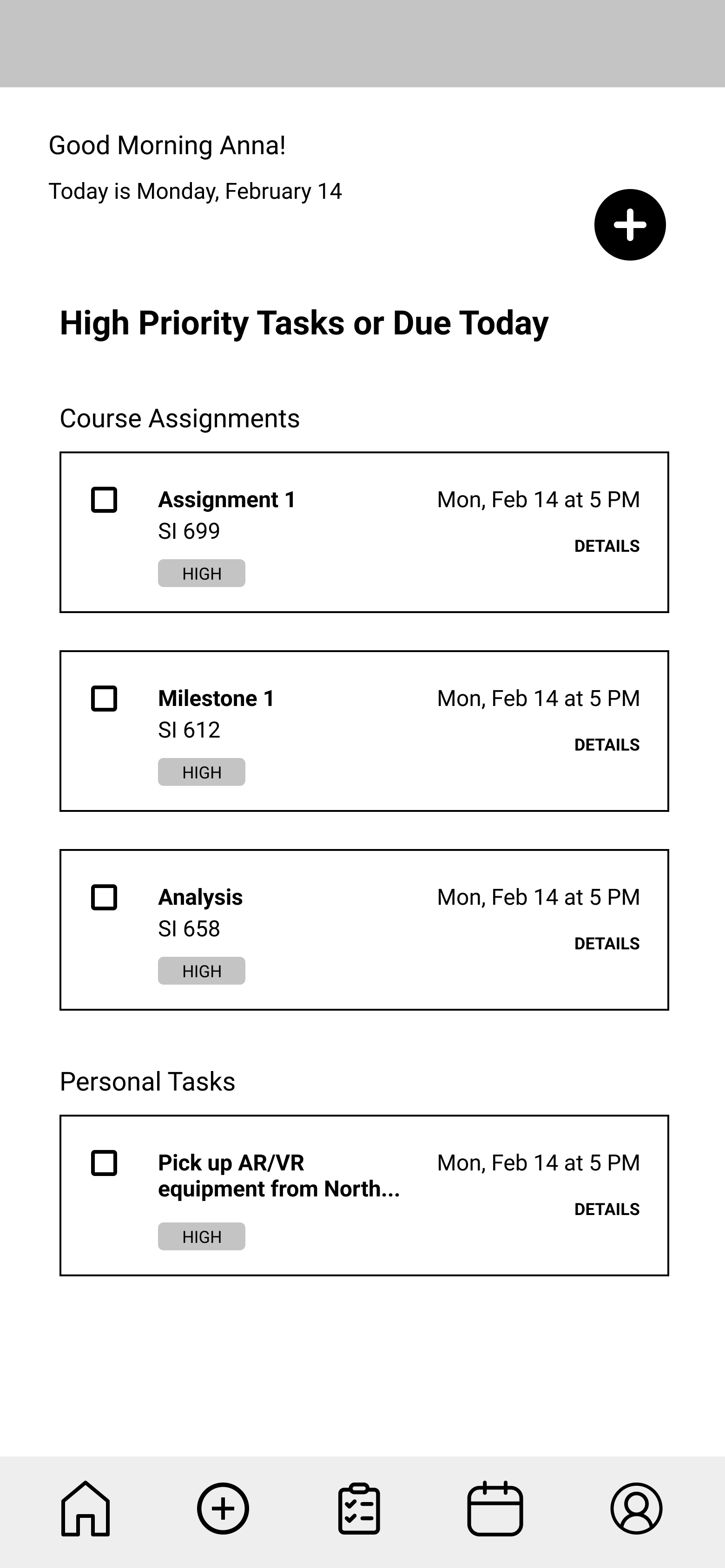
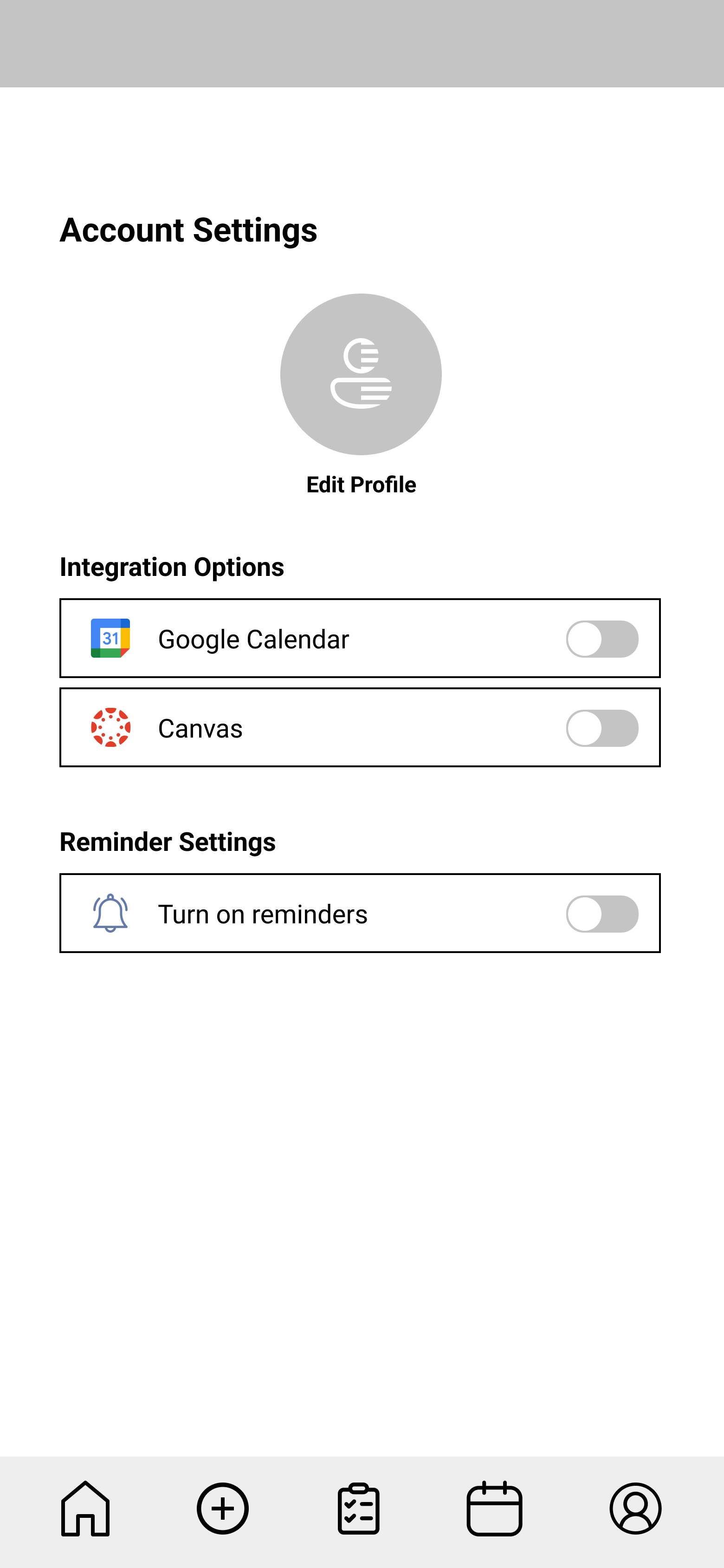
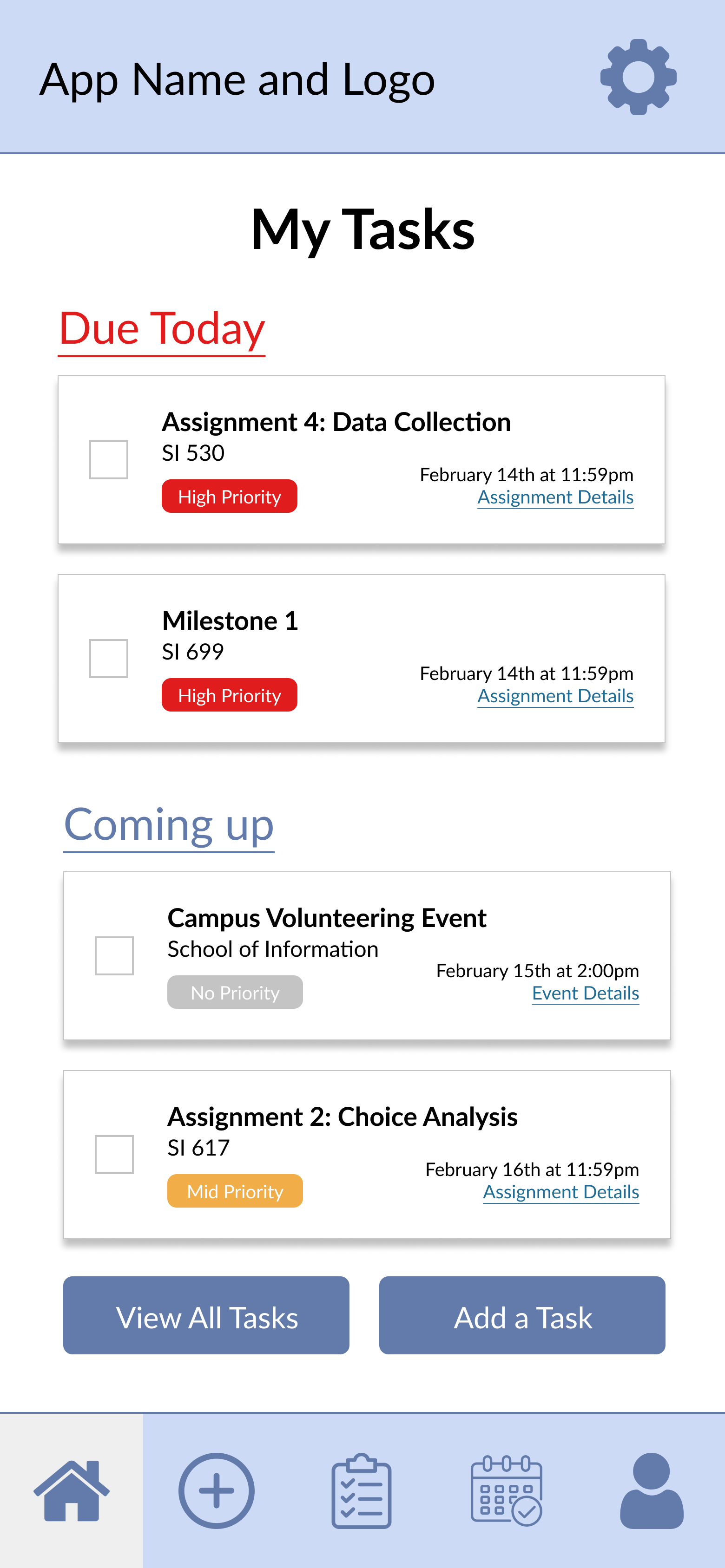
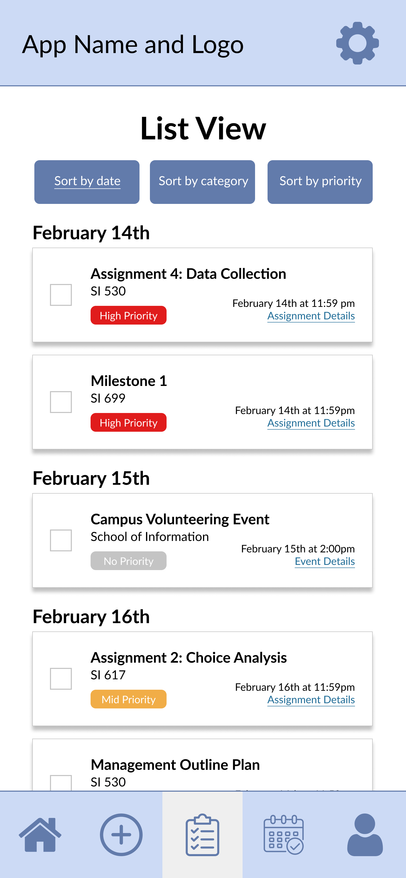
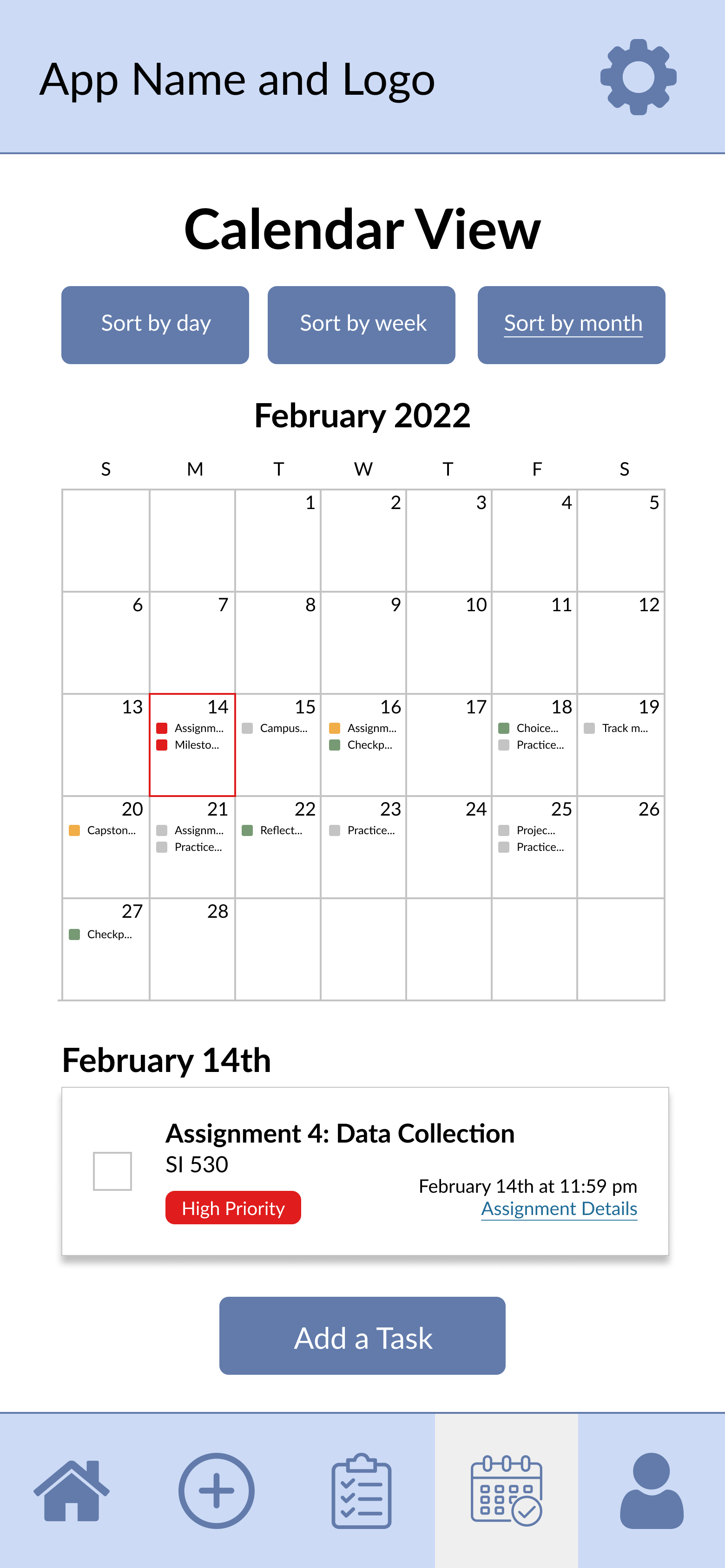
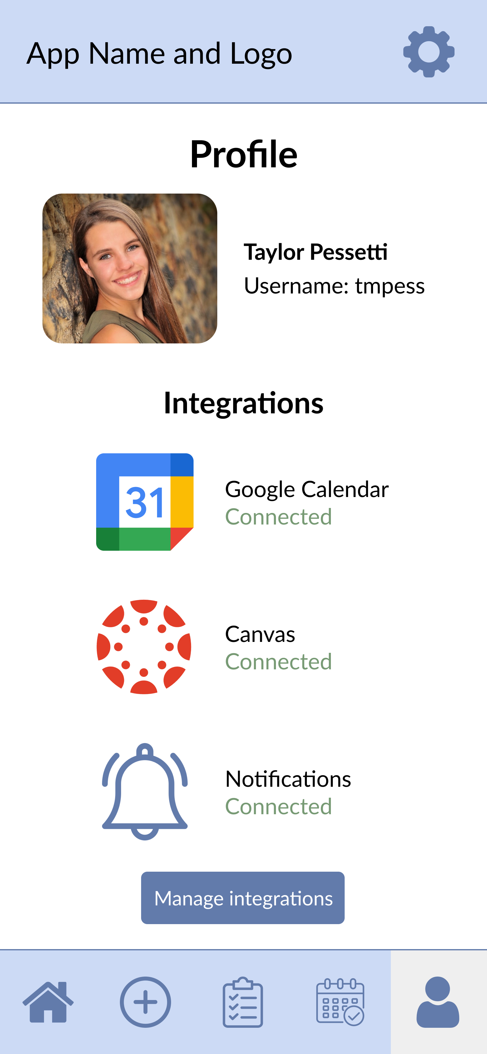
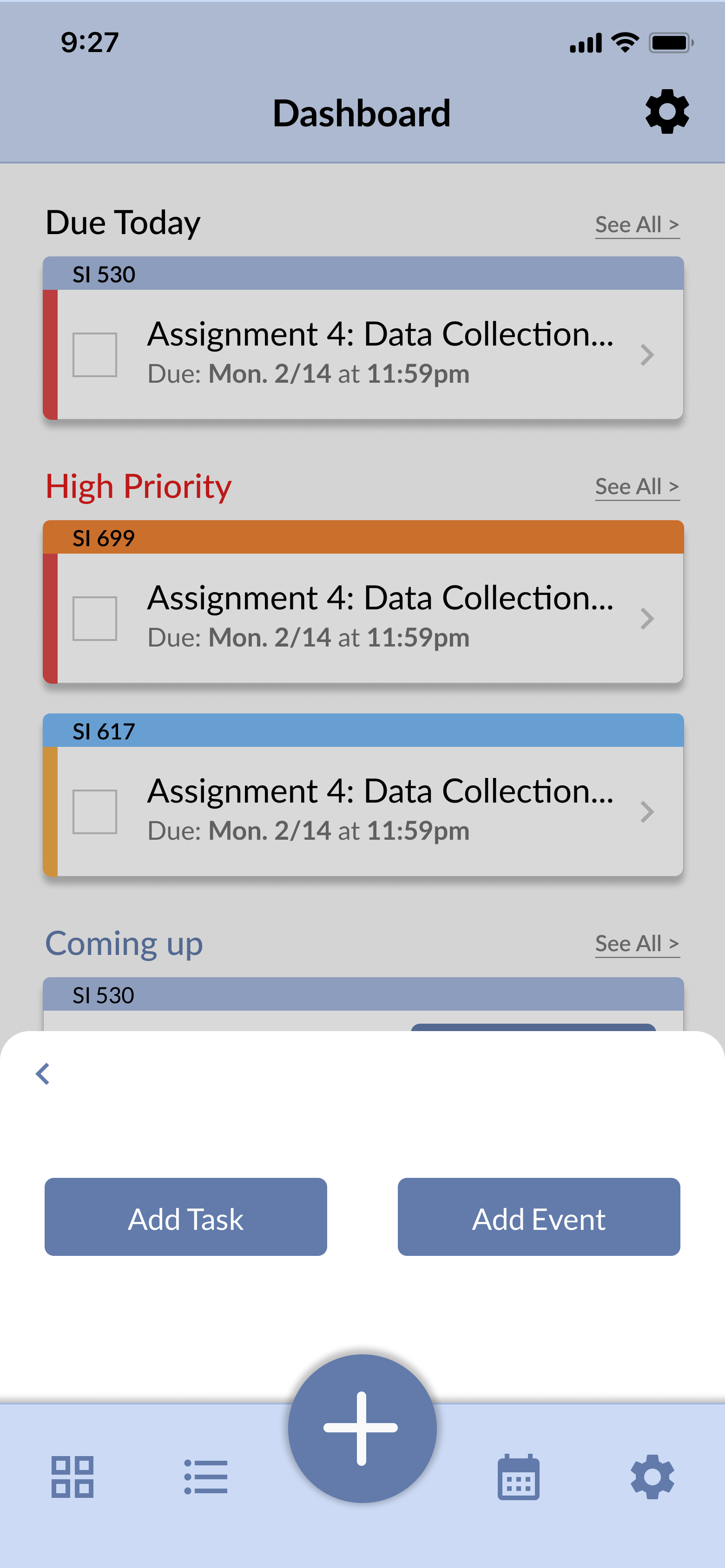
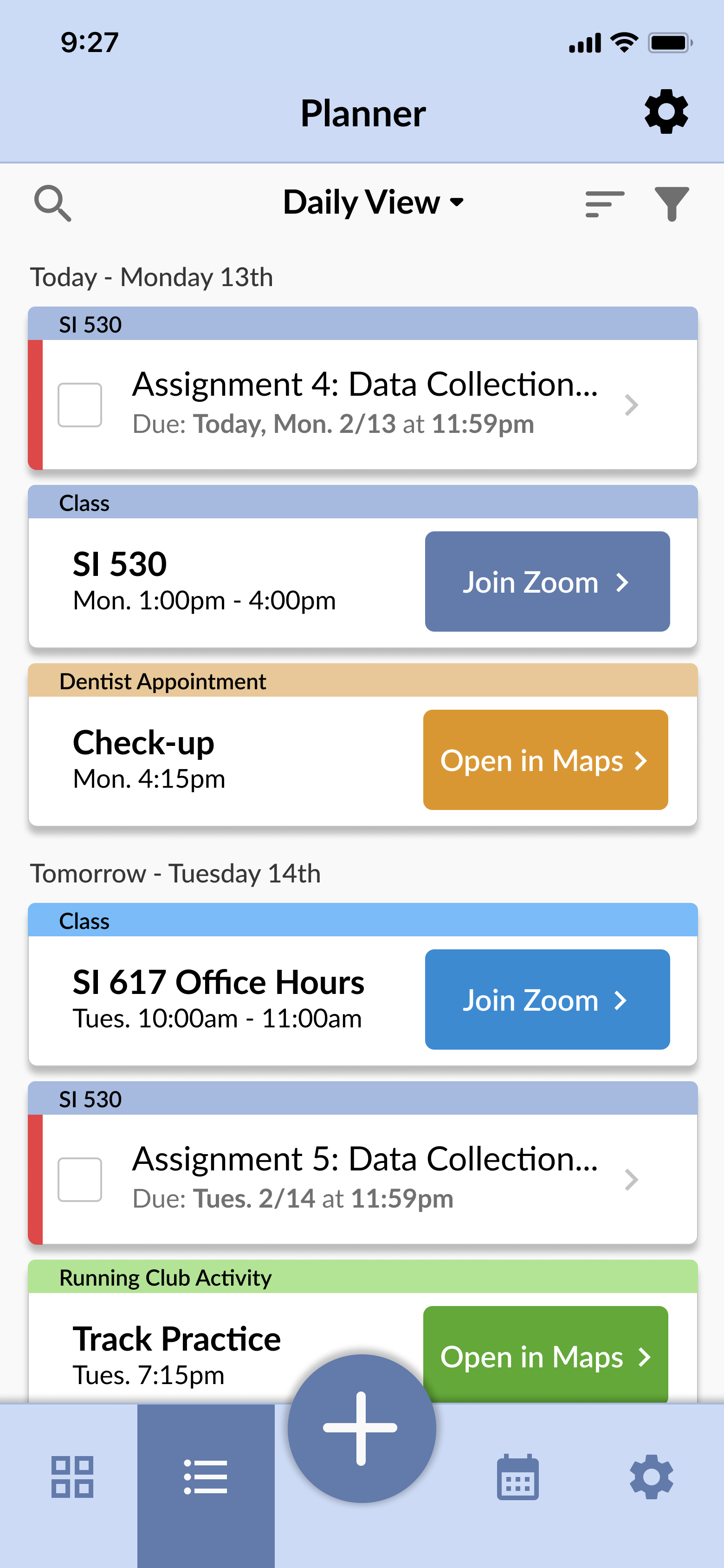
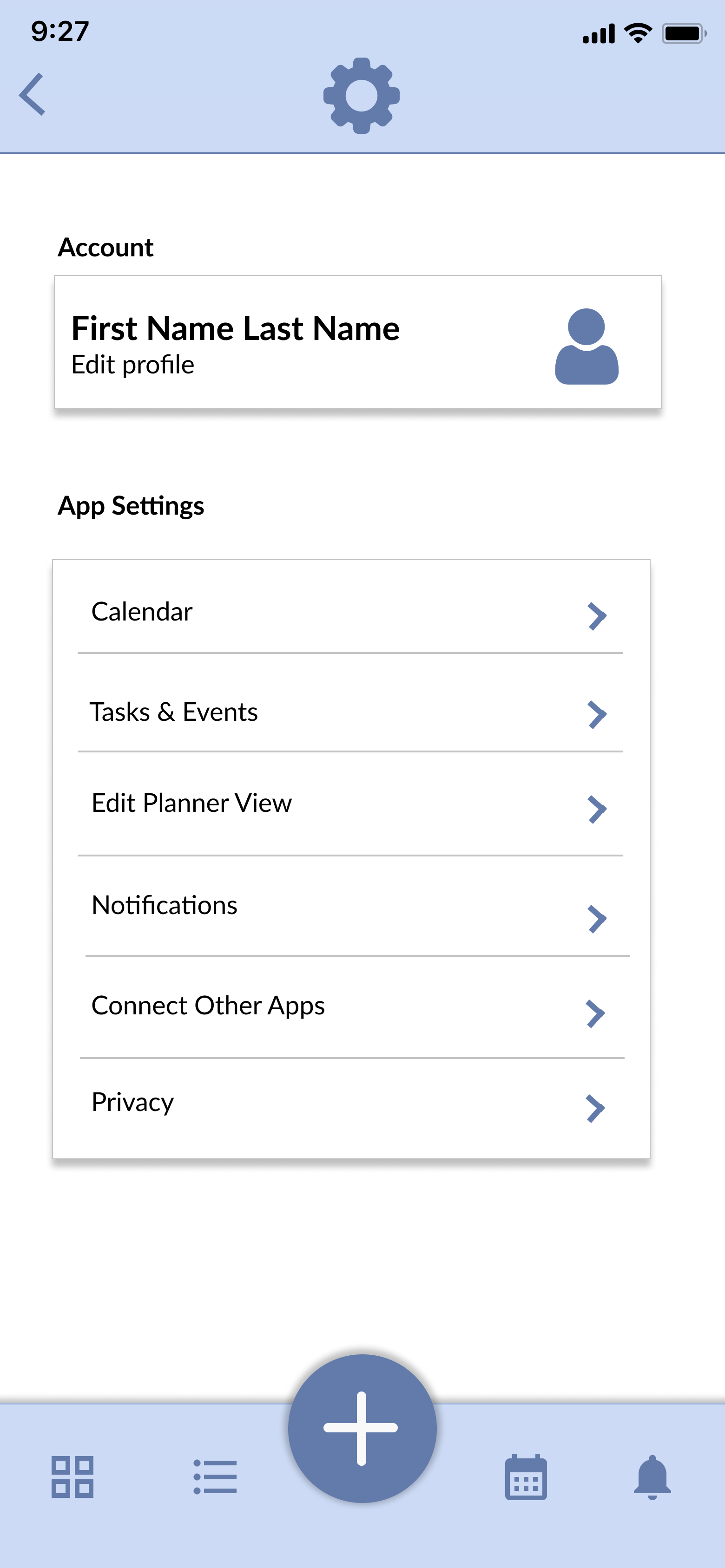
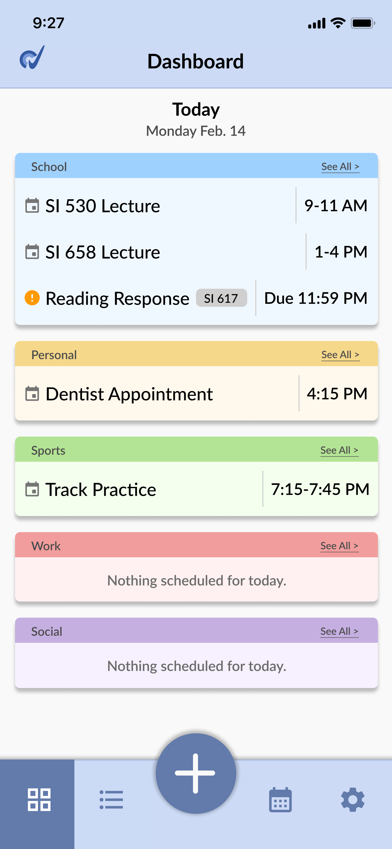
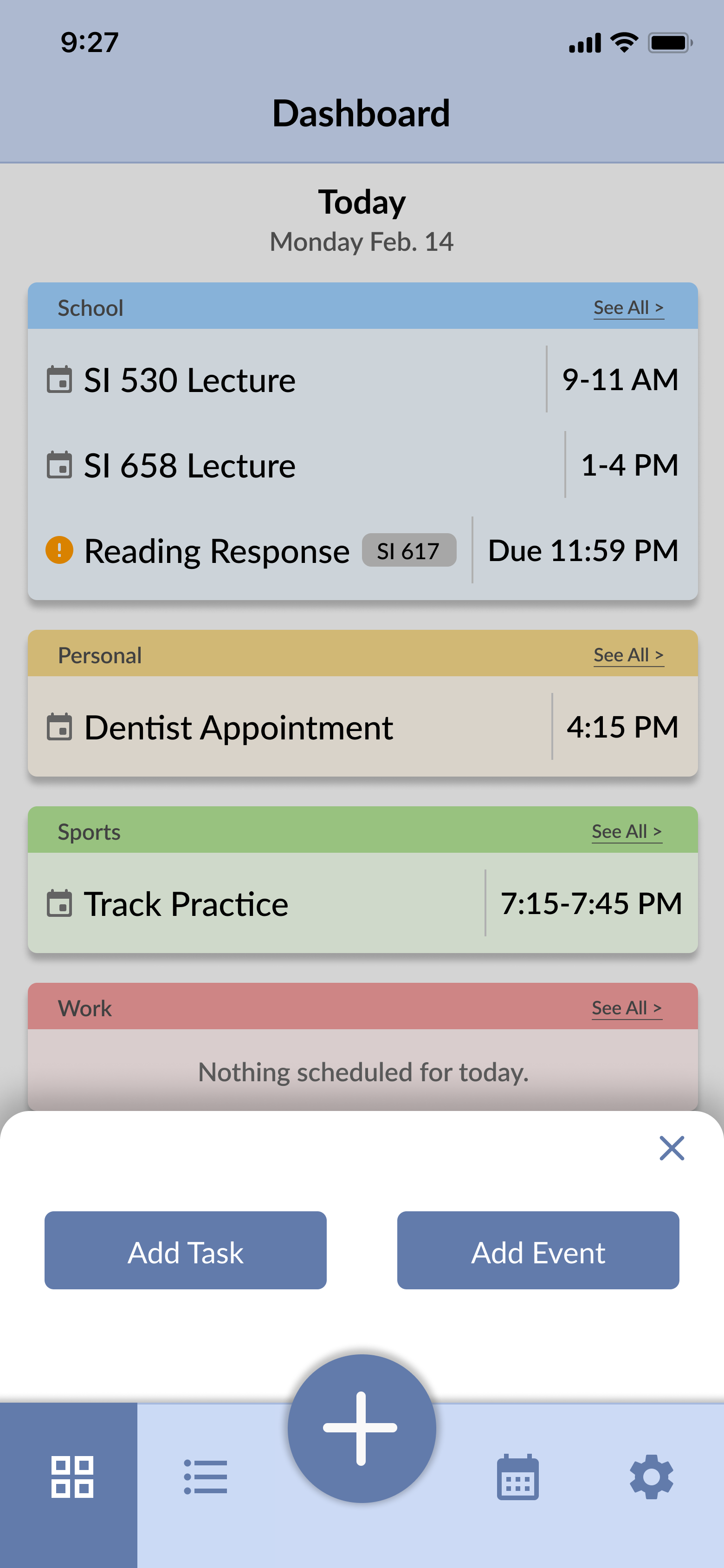
Prototype: Final Iteration
After conducting our user testing, the group designed our final prototype screens with important interactions fleshed out. These are some of the main screens we designed, and the full prototype can be viewed from the link below or at the top of this page.
Final Digital Prototype Advertisement
After completing our prototype, the team created a video advertisement representing the most important parts of our project.